
Continue to our Flutter learning journey, in this post, I will show you how easy it is to work with FloatingActionButton in Flutter.
FloatingActionButton in Flutter
In Material Design, FloatingActionButton, also called FAB, is to represent the main action of the screen, and it displays pretty bold to focus user attention to. It is usually put at bottom right of the screen.
Flutter UI is based on Material Design, so FAB is part of its support, very easy to make it.
Let's add FloatingActionButton to our Flutter applications.
We will start with this default page template.
import 'package:flutter/material.dart';

void main() {
  runApp(MaterialApp(
    home: HomeScreen(),
  ));
}

class HomeScreen extends StatefulWidget {
  @override
  _HomeScreenState createState() => _HomeScreenState();
}

class _HomeScreenState extends State<HomeScreen> {
  @override
  Widget build(BuildContext context) {
    return Scaffold(
        appBar: AppBar(
          backgroundColor: Colors.green,
          title: Text('fluttermaster.com'),
        ),
        body: Container(
          child: Center(
            child: Text('Working with FloatingActionButton', style: TextStyle(fontSize: 20.0),),
          ),
        ),
        floatingActionButton: (1)
        ,
    );
  }
}
Look at the position (1) on above code, you see the floatingActionButton property of the Scaffold widget. Why is there?
It is simple, I can explain like this. Scaffold is the fullscreen widget to draft the basic layout structure of a Material screen, and it often contains three main elements: appbar, body content, and floating action button. Because floating action button represents the primary action of the screen, the floatingActionButton on Scaffold totally makes sense. Without this, developers will need to write more code to add floating action button for every screen, and it is not very DRY.
Default FloatingActionButton
By default, only onPressed property is required, and this is a VoidCallback that is triggered upon user tap.
floatingActionButton: FloatingActionButton(
  onPressed: () { print('Clicked'); },
),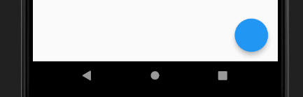
Well, it has no text or icon by default as you can see.
Add icon for FloatingActionButton
We need to provide icon to indicate the action of the screen, it should not be empty. We can achieve this by providing through the child property.
floatingActionButton: FloatingActionButton(
  child: Icon(Icons.add),
  onPressed: () { print('Clicked'); },),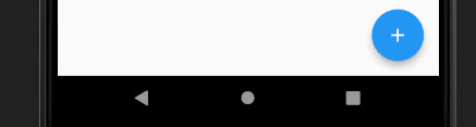
The + sign is commonly used for the adding new content action for screen. You can change it to any appropriate icon to represent your screen main action. Something like +1 is also interesting.
child: Icon(Icons.plus_one),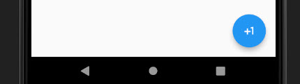
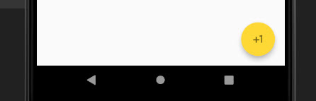
Change color
There are two properties you can use to change color for FloatingActionButton.
foregroundColoris for text/icon color.backgroundColoris for button background color.
floatingActionButton: FloatingActionButton(
foregroundColor: Colors.black54,
backgroundColor: Colors.yellow[600],
child: Icon(Icons.plus_one),
onPressed: () { print('Clicked'); },
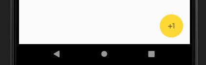
),This code will make a yellow floating action button with black text color.
Change elevation value
The FloatingActionButton has default value of elevation = 6.0. You can change to any value you want. If you want a shadowless button, just set it down to 0.
floatingActionButton: FloatingActionButton(
  foregroundColor: Colors.black54,
  backgroundColor: Colors.yellow[600],
  elevation: 0,
  child: Icon(Icons.plus_one),
  onPressed: () { print('Clicked'); },
),
Then we have a shadowless, no elevation, button.
Make mini FloatingActionButton
If you feel like the button is kinda big for the UI, you can make it smaller by configuring the mini value. It is a Boolean, and is false by default. Set mini: true to make it smaller.
floatingActionButton: FloatingActionButton(
foregroundColor: Colors.black54,
backgroundColor: Colors.yellow[600],
child: Icon(Icons.plus_one),
mini: true,
onPressed: () { print('Clicked'); },
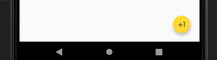
),And it becomes smaller.
Change FloatingActionButton location
To enforce the consistency of Material Design, the FloatingActionButton can't be changed via its property. It can be changed only via the floatingActionButtonLocation of Scaffold widget.
There are four positions you can choose to set location for FloatingActionButton.
FloatingActionButtonLocation.centerDocked: sticked to buttom center.FloatingActionButtonLocation.centerFloat: float at center of the bottom.FloatingActionButtonLocation.endDocked: sticked to buttom center.FloatingActionButtonLocation.endFloat: float at bottom center.
The default position is endFloat.
You can try to put it in buttom center position.
floatingActionButton: FloatingActionButton(
  child: Icon(Icons.add),
  onPressed: () { print('Clicked'); },
),
floatingActionButtonLocation: FloatingActionButtonLocation.centerFloat,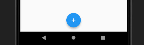
Summary
FloatingActionButton in Flutter is very easy to handle and customize as you can see. You can do anything with it, but make sure to stick to the Material Design to have the best user experiences for the app.
The code demo for this tutorial is here for your reference, https://github.com/petehouston/flutter-tips/tree/master/floatingactionbutton