
In this post, I will show you how to use Flutter RaisedButton, one of the most important widgets that you will use in all Flutter apps.
Flutter RaisedButton
In simple words, RaisedButton is a normal button but implemented with material ink spread effect upon clicking.
First, you should take a look at Flutter RaisedButton documentation to see its short explanation and its API to get some ideas out of it.
1. Basic RaisedButton
A barebone RaisedButton only requires only one property to make it, it is the callback @required VoidCallback onPressed .
It is the VoidCallback that is fired upon user click. Let's make it.
import 'package:flutter/material.dart';
import 'dart:async';

void main() {
  runApp(MaterialApp(
    home: HomeScreen(),
  ));
}

class HomeScreen extends StatelessWidget {
  @override
  Widget build(BuildContext context) {
    return Scaffold(
      body: Center(
        child: RaisedButton(
          onPressed: () {},
        ),
      ),
    );
  }
}
You can copy all of above code and paste into your main.dart file then build into devices. Or just copy only part of RaisedButton.
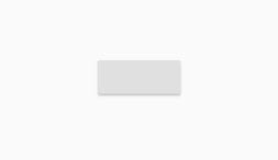
There is no text, no styling, but if you click or tap on it, the ink effect will spread out.
2. Add text to RaisedButton
Let's add text for the button, it can be done by providing a Text widget for the child property of RaisedButton.
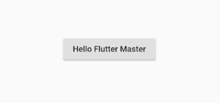
child: RaisedButton(
  child: Text('Hello Flutter Master'),
  onPressed: () {},
),
Refresh and you can see the button text.
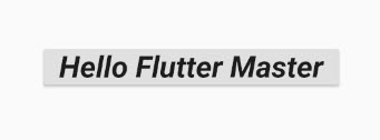
We can also provide some styling for the text, like size, family...
Let's make some change.
child: RaisedButton(
  child: Text('Hello Flutter Master',
    style: TextStyle(
      fontSize: 32.0,
      fontWeight: FontWeight.bold,
      fontStyle: FontStyle.italic,
      textBaseline: TextBaseline.alphabetic
  ),),
  onPressed: () {},
),
This is the result.
3. Change button color
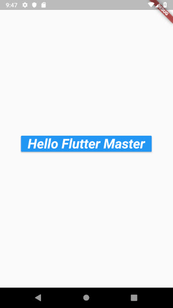
You will probably want to set color for the button, including: text color and background color.
This can be done via two properties: color for background and textColor for the text.
child: RaisedButton(
color: Colors.blue,
textColor: Colors.white,
child: Text('Hello Flutter Master',
style: TextStyle(
fontSize: 32.0,
fontWeight: FontWeight.bold,
fontStyle: FontStyle.italic,
textBaseline: TextBaseline.alphabetic
),),
onPressed: () {},
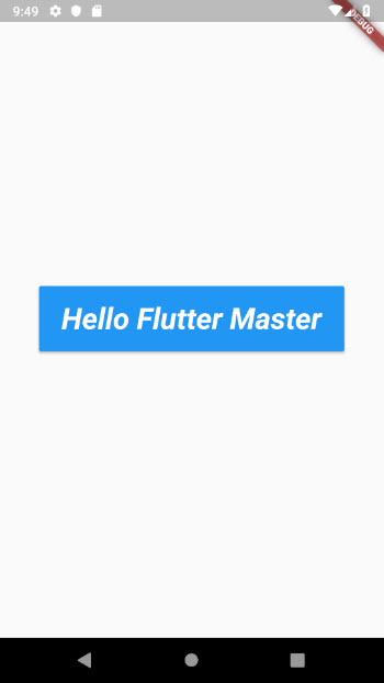
),The button looks a bit better now.
4. Set padding
Look, the text content is too close to the border, we need some padding for the content. The padding property is for this purpose.
child: RaisedButton(
          padding: EdgeInsets.symmetric(vertical: 16.0, horizontal: 24.0),
          color: Colors.blue,
          textColor: Colors.white,
          child: Text('Hello Flutter Master',
            style: TextStyle(
              fontSize: 32.0,
              fontWeight: FontWeight.bold,
              fontStyle: FontStyle.italic,
              textBaseline: TextBaseline.alphabetic
          ),),
          onPressed: () {},
        ),
Wow, it looks much better now.
5. Change the elevation
RaisedButton has a small shadow at default state, it is elevation, and value is default set to 2. You can change this value to any you want, or you can make it look flat, shadowless, by setting it to 0.
child: RaisedButton(
  elevation: 0,
  padding: EdgeInsets.symmetric(vertical: 16.0, horizontal: 24.0),
  color: Colors.blue,
  textColor: Colors.white,
  child: Text('Hello Flutter Master',
    style: TextStyle(
      fontSize: 32.0,
      fontWeight: FontWeight.bold,
      fontStyle: FontStyle.italic,
      textBaseline: TextBaseline.alphabetic
  ),),
  onPressed: () {},
),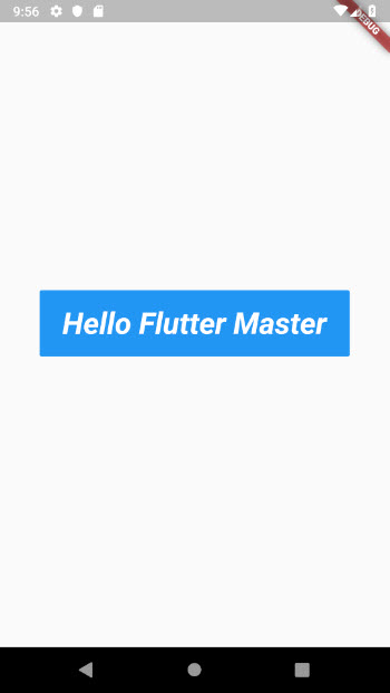
It looks flat, but when you click it will be lifted up. It's material!
6. Handle user tap or click
The onPressed is the only callback to handle user click event, and it is required. We can do any action in callback if necessary. For this demo, let's just print a simple log.
child: RaisedButton(
  elevation: 0,
  padding: EdgeInsets.symmetric(vertical: 16.0, horizontal: 24.0),
  color: Colors.blue,
  textColor: Colors.white,
  child: Text('Hello Flutter Master',
    style: TextStyle(
      fontSize: 32.0,
      fontWeight: FontWeight.bold,
      fontStyle: FontStyle.italic,
      textBaseline: TextBaseline.alphabetic
  ),),
  onPressed: () {
    print("Pressed on a RaisedButton");
  },
),
Summary
Up to this point, I believe you can customize and work with Flutter RaisedButton.
The complete code for this tutorial is here, https://github.com/petehouston/flutter-tips/tree/master/raisedbutton